
Clean and simple might look easy, but there are tons of concepts that are used when making a successful clean and simple design. Rules of contrast, or opposites are often the best way to make a design really work. While there are several different types of contrast that can be used, and a million ways to combine those types together, Nothing beats a clean and simple project to hit the nail on the head. Looking at a clean and simple layout, you can instantly feel if it works or not. While looking through today's projects you may notice that most have plenty of white space juxtaposed with a clustered area of interest. Many employ a contrast of highly saturated color against a white or neutral base. They may have textural elements combined with a smooth surface, or patterned areas paired with solids. As you look at each project, think about how many different types of contrast are at work, and you may just be amazed at what you find. I'll get you started with Donna's fabulous card as an example.
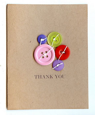
Practical Scrapper Donna
I chose this card, because it looks like the most simplistic of all today's examples. I can off the top of my head already see at least 5 types of contrast at work:
- Contrast of color. This example actually employs several of the 7 types of color contrast as explained by Johannes Itten's color theory. If you want to learn more, you can start with this brief explanation.
- Contrast of shape- round buttons against a rectangular base
- Contrast of texture- plastic and paper
- Contrast of scale- large and small buttons
- Contrast of visual weight- balancing a small cluster of highly interesting elements against a large plain expanse.

Practical Scrapper Cathy
 Reader Brenda Ragsdale
.JPG) Practical Scrapper Mary Pat Siehl
Practical Scrapper Mary Pat Siehl
 Reader Donna Thomas

Practical Scrapper Cathy
 Reader Kim Martin
 Practical Scrapper Christa
 Fresh Face Designer Laura Cox
 Fresh Face designer Julie
 Practical Scrapper Caz
 Reader Marg Van Patten

Happy Monday!


.JPG)


Practical Scrapper Leila
I hope I haven't bored you with today's design lesson. This is by no means a complete overview of principles of contrast in design, but just a little food for thought. What may look like an easy simple design, if successful, actually involves an intricate balance of a multitude of contrasts. My hat is off to the wonderful artists who have developed the eye required to make such a bold statement with a minimalist palette.
6 comments:
Great explanation and samples...love it
TFS
Great info! You explained it very well. Some lovely projects too.
love the clean and simple tips!!!
These are ALL gorgeous projects!! Thanks for the inspiration!!
I love clena and simple so these ideas and examples was great!!!
I loved learning about what makes a truly Clean and Simple design and still have it appear FINISHED. Thanks Erin!
Post a Comment